Connect with us!
Building A Login page in GTA 5 Style Using HTML,CSS &JavaScript with Source Code For Beginners
Introduction
Hi everyone, welcome back to Salow Studios. In today’s video, I m going to walk through a complete login form built with HTML, CSS, and JavaScript. I’ll go through the code line by line, explaining how each part works and how everything comes together to create a beautiful, functional login page. Let’s get started!
Source Code
- Github Source code – Star the project for future updates – Github Link
- Live Demo of the website – Click Here
Video Explanation
Check out the Youtube on Building A Login page in GTA 5 Style Using HTML,CSS &JavaScript with Source Code For Beginners
HTML Explanation
Now lets go though the explanation.
Line 1:
<!DOCTYPE html>We start with the <!DOCTYPE html> declaration. This tells the browser that our document is an HTML5 document.
Line 2:
<html lang="en">Next, we open the <html> tag and set the language to English with lang="en".
Line 3-6:
<head>
  <meta charset="UTF-8" />
  <meta name="viewport" content="width=device-width, initial-scale=1.0" />
  <link href="https://cdn.jsdelivr.net/npm/remixicon@4.1.0/fonts/remixicon.css" rel="stylesheet" />
Inside the <head> section, we first define the character encoding using <meta charset="UTF-8">. This ensures that our text displays correctly. The next meta tag <meta name="viewport" content="width=device-width, initial-scale=1.0"> makes our page responsive on different screen sizes. We also link to Remix Icon’s stylesheet for icons using the <link> tag.
Line 7:
<link rel="stylesheet" href="styles.css" />Here, we’re linking to our external CSS file styles.css, which contains the styles for our login page.
Line 8:
<title>Salow Studios | Sign In Page</title>The <title> tag sets the title of the webpage, which appears in the browser tab.
Line 9-10:
</head>
<body>
We close the head section and open the body section where all the visible content goes.
Line 11-27:
<div class="login-container">
  <form action="../index.html" class="login-form">
    <h1>Sign In</h1>
    <div class="form-group">
      <span><i class="ri-user-3-line"></i></span>
      <div class="input-wrapper">
        <input type="text" placeholder=" " id="name" />
        <label for="name">Name</label>
      </div>
    </div>
    <div class="form-group">
      <span><i class="ri-lock-2-line"></i></span>
      <div class="input-wrapper">
        <input id="password" type="password" placeholder=" " />
        <label for="password">Password</label>
      </div>
      <span id="toggle-password"><i class="ri-eye-off-line"></i></span>
    </div>
    <div class="form-actions">
      <div class="remember-me">
        <input type="checkbox" id="remember" />
        <label for="remember">Remember me</label>
      </div>
      <a href="#" class="forgot-password">Forgot Password?</a>
    </div>
    <button class="submit-btn">Login</button>
    <div class="register">
      Don't have an account? <a href="#">Register</a>
    </div>
  </form>
</div>
Here’s where the structure of our form comes to life. Let’s break this down:
<div class="login-container">: Thisdivwraps our entire form and centers it on the page.<form action="../index.html" class="login-form">: The form itself, which will send data to the server when submitted. Theaction="../index.html"indicates the form’s destination when submitted.<h1>Login</h1>: The title of the form.<div class="form-group">: Each input field is wrapped inside thisdivfor styling and layout purposes.<span><i class="ri-user-3-line"></i></span>: Thisspancontains the user icon, enhancing the input field’s appearance.<div class="input-wrapper">: Wraps the input and label together for better control over their behavior.<input type="text" placeholder=" " id="name" />: The input field for the user’s name.<label for="name">Name</label>: The label associated with the name input.<span id="toggle-password"><i class="ri-eye-off-line"></i></span>: Thisspanis used to toggle the visibility of the password.<div class="form-actions">: Thisdivgroups the “Remember me” checkbox and “Forgot Password?” link together.<button class="submit-btn">Login</button>: The submit button that the user clicks to log in.<div class="register">: A message and link for users who don’t have an account yet.
Line 28:
<script src="main.js"></script>We link to an external JavaScript file main.js that contains the logic for our form’s behavior.
Line 29-30:
</body>
</html>
Finally, we close the body and html tags, wrapping up the HTML document.
CSS Explanation
Line 1:
@import url("https://fonts.googleapis.ycom/css2?family=Poppins:wght@400;500;600;700&display=swap");We import the “Poppins” font from Google Fonts to style our text.
Line 2-6:
:root {
  --text-dark: #171717;
  --text-light: #e5e5e5;
  --white: #ffffff;
}
Here, we define custom CSS variables for colors that we’ll use throughout the design. This makes it easier to maintain and change colors later if needed.
Line 7-11:
* {
  padding: 0;
  margin: 0;
  box-sizing: border-box;
}
We reset the default padding and margin for all elements and ensure that padding and borders are included in the element’s total width and height.
Line 12-15:
body {
  font-family: "Poppins", sans-serif;
}
We apply the “Poppins” font to the entire body of the document.
Line 16-20:
.login-container {
  min-height: 100vh;
  background: url("assets/bg.jpg") center/cover no-repeat;
  display: flex;
  align-items: center;
  justify-content: center;
}
The login-container class ensures that our form is centered vertically and horizontally on the page, with a background image covering the entire viewport.
Line 21-36:
.login-form {
  width: 100%;
  max-width: 420px;
  padding: 4rem 3rem;
  margin: 1rem;
  backdrop-filter: blur(8px);
  border: 2px solid var(--white);
  border-radius: 1.5rem;

  opacity: 0;
  transform: translateY(50px);
  animation: fadeIn 0.5s linear forwards;
}
The login-form class defines the style of our form, including size, padding, and animation. The fadeIn animation creates a smooth entrance effect when the page loads.
Line 37-41:
@keyframes fadeIn {
  to {
    opacity: 1;
    transform: translateY(0);
  }
}
This defines the fadeIn animation, gradually increasing the form’s opacity and moving it into place.
Line 42-45:
.login-form h1 {
  margin-bottom: 2rem;
  font-size: 2rem;
  font-weight: 500;
  color: var(--white);
  text-align: center;
}
Here, we style the <h1> heading inside the form, centering it and setting the color to white.
Line 46-50:
.form-group {
  margin-bottom: 1.5rem;
  padding-block: 5px;
  display: flex;
  align-items: center;
  gap: 10px;
  border-bottom: 2px solid var(--white);
}
The form-group class ensures that each input field and its associated icon are aligned and spaced correctly, with a border below them.
Line 51-54:
.input-wrapper {
  flex: 1;
  position: relative;
  isolation: isolate;
}
The input-wrapper class allows us to position the label and input field relative to each other, making it easier to control their interaction.
Line 55-58:
.form-group span {
  font-size: 1.25rem;
  color: var(--white);
}
We style the icons inside each input group, setting the size and color.
Line 59-64:
.input-wrapper label {
  position: absolute;
  font-size: 1rem;
  color: var(--white);


 top: 0;
  left: 0;
  transition: 0.3s;
  pointer-events: none;
}
The label inside input-wrapper is absolutely positioned and transitions smoothly when the input is focused or filled.
Line 65-68:
.input-wrapper input:not(:placeholder-shown) ~ label,
.input-wrapper input:focus ~ label {
  font-size: 0.7rem;
  top: -1.25rem;
}
These styles move the label above the input field when the user interacts with it, creating a neat floating label effect.
Line 69-73:
.input-wrapper input {
  width: 100%;
  outline: none;
  border: none;
  font-size: 1.2rem;
  color: var(--white);
  background-color: transparent;
}
The input fields are styled to be full width, with no borders, allowing the background to show through.
Line 74-76:
#toggle-password {
  cursor: pointer;
}
The #toggle-password element changes the cursor to a pointer, indicating it’s clickable.
Line 77-81:
.form-actions {
  margin-bottom: 1.5rem;
  display: flex;
  align-items: center;
  justify-content: space-between;
}
The form-actions class ensures the “Remember me” checkbox and “Forgot Password?” link are aligned and spaced properly.
Line 82-86:
.remember-me {
  display: flex;
  align-items: center;
  gap: 5px;
}
The remember-me class aligns the checkbox and label next to each other with some spacing.
Line 87-91:
.remember-me label {
  font-size: 0.9rem;
  color: var(--text-light);
  cursor: pointer;
  transition: 0.3s;
}
We style the label for the “Remember me” checkbox and add a hover effect.
Line 92-95:
input[type="checkbox"] {
  accent-color: var(--white);
  color: var(--text-dark);
}
This ensures the checkbox matches the overall design, with white as the accent color.
Line 96-100:
.forgot-password {
  text-decoration: none;
  font-size: 0.9rem;
  color: var(--text-light);
  transition: 0.3s;
}
The forgot-password link is styled to match the design and includes a hover effect.
Line 101-107:
.submit-btn {
  margin-bottom: 2rem;
  padding: 1rem;
  width: 100%;
  outline: none;
  border: none;
  font-size: 1rem;
  font-weight: 600;
  color: var(--text-dark);
  background-color: var(--white);
  border-radius: 5px;
  cursor: pointer;
  transition: 0.3s;
}
The submit-btn is styled to stand out, with a solid white background and smooth hover effect.
Line 108-111:
.register {
  color: var(--text-light);
  text-align: center;
}
The register class styles the text at the bottom, which encourages users to sign up if they don’t have an account.
Line 112-115:
.register a {
  text-decoration: none;
  font-weight: 500;
  color: var(--white);
}
The link inside the register class is styled to match the rest of the form, with no underline and white text.
JavaScript Explanation
Line 1:
const togglePasswordBtn = document.getElementById("toggle-password");We start by selecting the element that will toggle the password visibility.
Line 2-7:
togglePasswordBtn.addEventListener("click", () => {
  const passwordInput = document.getElementById("password");
  const icon = togglePasswordBtn.querySelector("i");
  const isVisible = passwordInput.type === "text";
  passwordInput.type = isVisible ? "password" : "text";
  icon.className = isVisible ? "ri-eye-off-line" : "ri-eye-line";
});
Here, we add a click event listener to the toggle button. When clicked, it checks the current type of the password input:
- If it’s text, meaning the password is visible, we change it back to password and switch the icon to a closed eye.
- If it’s password, we switch it to text to make the password visible and change the icon to an open eye.
This simple script provides a nice user experience by allowing them to view or hide their password as needed.
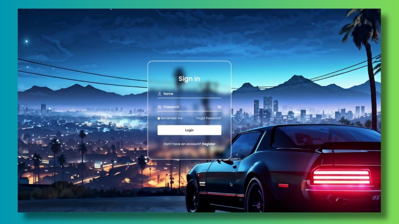
Final Output
Final output of the page we created.

Conclusion
And that’s it! We’ve walked through the entire codebase for this login form, covering everything from the HTML structure to the CSS styling and JavaScript interactivity. I hope you found this tutorial helpful. If you did, don’t forget to give this video a thumbs up, and subscribe to the channel for more web development tutorials.
Thanks for watching, and I’ll see you in the next video! Checkout our other tutorials – CSS Tutorials


