Connect with us!
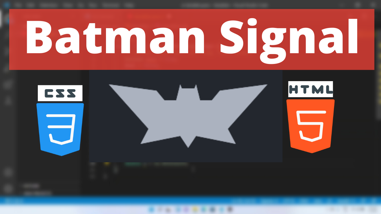
Batman signal call Animation HTML and CSS
What does the Batman symbol mean? The Batman logo and symbol are meant to represent a hero of the night. It was designed to create fear when criminals would see it shining in the dark sky. In this tutorial lets design using HTML and CSS.
CSS Properties
Following are the CSS properties used:
Height: The height CSS property specifies the height of an element. By default, the property defines the height of the content area. If box-sizing is set to border-box, however, it instead determines the height of the border area.
Left: The left CSS property participates in specifying the horizontal position of a positioned element. It has no effect on non-positioned elements.
Background: The background shorthand CSS property sets all background style properties at once, such as color, image, origin and size, or repeat method.
Width: The width CSS property sets an element’s width. By default, it sets the width of the content area, but if box-sizing is set to border-box, it sets the width of the border area.
Position: The position CSS property sets how an element is positioned in a document. The top, right, bottom, and left properties determine the final location of positioned elements.
Inset: The inset CSS property is a shorthand that corresponds to the top, right, bottom, and/or left properties. It has the same multi-value syntax of the margin shorthand.
Clip-path: The clip-path CSS property creates a clipping region that sets what part of an element should be shown. Parts that are inside the region are shown, while those outside are hidden.
Top: The top CSS property participates in specifying the vertical position of a positioned element. It has no effect on non-positioned elements.
Box-shadow: The box-shadow CSS property adds shadow effects around an element’s frame. You can set multiple effects separated by commas. A box shadow is described by X and Y offsets relative to the element, blur and spread radius, and color.
Content: The content CSS property replaces an element with a generated value. Objects inserted using the content property are anonymous replaced elements.
Batman signal Code Block
Here is the code for implementing the Batman Symbol Animation.
.batman:after {

      }
      .batman {
        width: 100px;
        height: 45px;
        left: 100px;
        top: 100px;
        position: absolute;
      }
      .batman:before,
      .batman:after {
        content: "";
        position: absolute;
        inset: 0;
        background: #abb2bf;
        box-shadow: 0 0 0 50px;
        clip-path: polygon(
          -50px -20px,
          10% -12px,
          20% 0,
          calc(50% - 15px) 0,
          calc(50% - 10px) -20px,
          calc(50% - 8px) -15px,
          calc(50% + 8px) -15px,
          calc(50% + 10px) -20px,
          calc(50% + 15px) 0,
          80% 0,
          90% -12px,
          calc(100% + 50px) -20px,
          100% 80%,
          calc(100% + 10px) calc(100% + 10px),
          60% 100%,
          50% calc(100% + 15px),
          40% 100%,
          -10px calc(100% + 10px),
          0 80%
        );
      }
Yay! We have created the static Batman Symbol Animation.
Here is the output:

Batman signal CSS Animation
pulse-animation animation can be implemented by scaling up and down the shape linearly.
Following are the classes used for animation.
The @keyframes CSS at-rule controls the intermediate steps in a CSS animation sequence by defining styles for keyframes (or waypoints) along the animation sequence. This gives more control over the intermediate steps of the animation sequence than transitions.
The transform CSS property lets you rotate, scale, skew, or translate an element. It modifies the coordinate space of the CSS visual formatting model.
Here is the CSS animation class implementing CSS.
@keyframes  pulse-animation {
        to {
          transform: perspective(300px) translateZ(100px);
          opacity: 0;
        }
      }
The following way is to declare the CSS Class inside the class block.
 .batman:after {
        animation: pulse-animation 1s infinite;
      }
      .batman {
        width: 100px;
        height: 45px;
        left: 100px;
        top: 100px;
        position: absolute;
      }
      .batman:before,
      .batman:after {
        content: "";
        position: absolute;
        inset: 0;
        background: #abb2bf;
        box-shadow: 0 0 0 50px;
        clip-path: polygon(
          -50px -20px,
          10% -12px,
          20% 0,
          calc(50% - 15px) 0,
          calc(50% - 10px) -20px,
          calc(50% - 8px) -15px,
          calc(50% + 8px) -15px,
          calc(50% + 10px) -20px,
          calc(50% + 15px) 0,
          80% 0,
          90% -12px,
          calc(100% + 50px) -20px,
          100% 80%,
          calc(100% + 10px) calc(100% + 10px),
          60% 100%,
          50% calc(100% + 15px),
          40% 100%,
          -10px calc(100% + 10px),
          0 80%
        );
      }
      @keyframes pulse-animation {
        to {
          transform: perspective(300px) translateZ(100px);
          opacity: 0;
        }
      }
Following is the output for Batman Symbol Animation animation.

Batman signal Video Tutorial
You can find the complete coding tutorial in the following YouTube Short video.
Complete Code using HTML and CSS
Copy and paste the complete code in Visual studio code to view the output.
<!DOCTYPE html>
<html lang="en">
  <head>
    <style>
      .batman:after {
        animation: pulse-animation 1s infinite;
      }
      .batman {
        width: 100px;
        height: 45px;
        left: 100px;
        top: 100px;
        position: absolute;
      }
      .batman:before,
      .batman:after {
        content: "";
        position: absolute;
        inset: 0;
        background: #abb2bf;
        box-shadow: 0 0 0 50px;
        clip-path: polygon(
          -50px -20px,
          10% -12px,
          20% 0,
          calc(50% - 15px) 0,
          calc(50% - 10px) -20px,
          calc(50% - 8px) -15px,
          calc(50% + 8px) -15px,
          calc(50% + 10px) -20px,
          calc(50% + 15px) 0,
          80% 0,
          90% -12px,
          calc(100% + 50px) -20px,
          100% 80%,
          calc(100% + 10px) calc(100% + 10px),
          60% 100%,
          50% calc(100% + 15px),
          40% 100%,
          -10px calc(100% + 10px),
          0 80%
        );
      }
      @keyframes pulse-animation {
        to {
          transform: perspective(300px) translateZ(100px);
          opacity: 0;
        }
      }
    </style>
    <title>Salow Studios</title>
  </head>
  <body>
    <h1>Batman Symbol Animation</h1>
    <div class="batman"></div>
  </body>
</html>
Thank you for reading this article. I hope that it helps you creating your own Batman Symbol Animation Animation using CSS and HTML. See you in next tutorial!


