Connect with us!
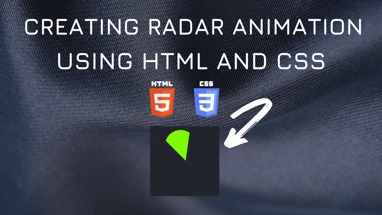
Radar Scan Animation using HTML5 and CSS3
Radar detects any near by objects within its range. In this tutorial we will be animating radar symbol using CSS and HTML.
Following is the CSS Class for Radar scan Symbol.
.scanner {
    width: 0;
    height: 0;
    margin-left: 50px;
    border-top: 100px solid chartreuse;
    border-left: 50px solid transparent;
    border-right: 50px solid transparent;
    border-radius: 50%;
    transform-origin: bottom center;
}
The above code creates a static output

The following code is to add animation to the Yin Yang symbol. We will try to spin the symbol. We rotate the Symbol to 360 degrees thus creating the spinning effect
@keyframes spin {
    100% {
        -webkit-transform: rotate(360deg);
        transform: rotate(360deg);
    }
}
Below is the spinning animation of Radar Scanner.

You can find the complete coding in Visual Studio Code tutorial in the following YouTube Video.
<!DOCTYPE html>
<html lang="en">
  <head>
    <style>
      .scanner {
        width: 0;
        height: 0;
        margin-left: 50px;
        border-top: 100px solid chartreuse;
        border-left: 50px solid transparent;
        border-right: 50px solid transparent;
        border-radius: 50%;
        transform-origin: bottom center;
        animation: spin 2s linear infinite;
      }

      @keyframes spin {
        100% {
          -webkit-transform: rotate(360deg);
          transform: rotate(360deg);
        }
      }
    </style>
    <title>Salow Studios</title>
  </head>
  <body>
    <h1 class="h1">Radar Scanner Animation</h1>
    <div class="scanner"></div>
  </body>
</html>
Thank you for reading. I hope that it has helped you with your project. Good luck and happy coding!
See you in another tutorial!


