Connect with us!
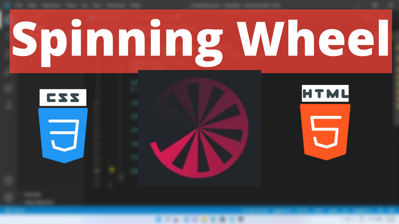
Spinning Wheel preloader Animation HTML and CSS tutorial for beginners #shorts #coding
Essentially, preloaders (also known as loaders) are what you see on the screen while the rest of the page’s content is still loading. Preloaders are often simple or complex animations that are used to keep visitors entertained while server operations finish processing.
Spinning wheel is a animation loader using HTML and CSS. You can use it in your own website.
The transform CSS property lets you rotate, scale, skew, or translate an element. It modifies the coordinate space of the CSS visual formatting model.
The animation shorthand CSS property applies an animation between styles. It is a shorthand for animation-name, animation-duration, animation-timing-function, animation-delay, animation-iteration-count, animation-direction, animation-fill-mode, and animation-play-state.
Spinning Wheel Code Block
Here is the code for implementing the Spinning wheel preloader.
.wheel-spinner {
        width: 150px;
        height: 150px;
        border-radius: 50%;
        padding: 1px;
        background: conic-gradient(#0000 10%, #f03355);
        -webkit-mask: repeating-conic-gradient(
            #0000 0deg,
            #000 1deg 20deg,
            #0000 21deg 36deg
          ),
          radial-gradient(
            farthest-side,
            #0000 calc(100% - 9px),
            #000 calc(100% - 8px)
          );
      }
Yay! We have created the static wheel symbol.
Here is the output:

Spinning Wheel CSS Animation
Pumping animation can be implemented by scaling up and down the shape linearly.
Following are the classes used for animation.
The @keyframes CSS at-rule controls the intermediate steps in a CSS animation sequence by defining styles for keyframes (or waypoints) along the animation sequence. This gives more control over the intermediate steps of the animation sequence than transitions.
The transform CSS property lets you rotate, scale, skew, or translate an element. It modifies the coordinate space of the CSS visual formatting model.
Here is the CSS animation class implementing CSS.
@keyframes spin {
        to {
          transform: rotate(1turn);
        }
      }
The following way is to declare the CSS Class inside the class block.
 @keyframes spin {
        to {
          transform: rotate(1turn);
        }
      }
      .wheel-spinner {
        animation: spin 1s infinite steps(10);
        width: 150px;
        height: 150px;
        border-radius: 50%;
        padding: 1px;
        background: conic-gradient(#0000 10%, #f03355);
        -webkit-mask: repeating-conic-gradient(
            #0000 0deg,
            #000 1deg 20deg,
            #0000 21deg 36deg
          ),
          radial-gradient(
            farthest-side,
            #0000 calc(100% - 9px),
            #000 calc(100% - 8px)
          );
      }
Following is the output for wheel preloader animation.

Spinning Wheel Video Tutorial
You can find the complete coding tutorial in the following YouTube Short video.
Complete Code using HTML and CSS
Copy and paste the complete code in Visual studio code to view the output.
<!DOCTYPE html>
<html lang="en">
  <head>
    <style>
      @keyframes spin {
        to {
          transform: rotate(1turn);
        }
      }
      .wheel-spinner {
        animation: spin 1s infinite steps(10);
        width: 150px;
        height: 150px;
        border-radius: 50%;
        padding: 1px;
        background: conic-gradient(#0000 10%, #f03355);
        -webkit-mask: repeating-conic-gradient(
            #0000 0deg,
            #000 1deg 20deg,
            #0000 21deg 36deg
          ),
          radial-gradient(
            farthest-side,
            #0000 calc(100% - 9px),
            #000 calc(100% - 8px)
          );
      }
    </style>
    <title>Salow Studios</title>
  </head>
  <body>
    <h1>Wheel Preloader Animation</h1>
    <div class="wheel-spinner"></div>
  </body>
</html>
Thank you for reading this article. I hope that it helps you creating your own Shapeshifting Animation using CSS and HTML. See you in next tutorial!


