Connect with us!
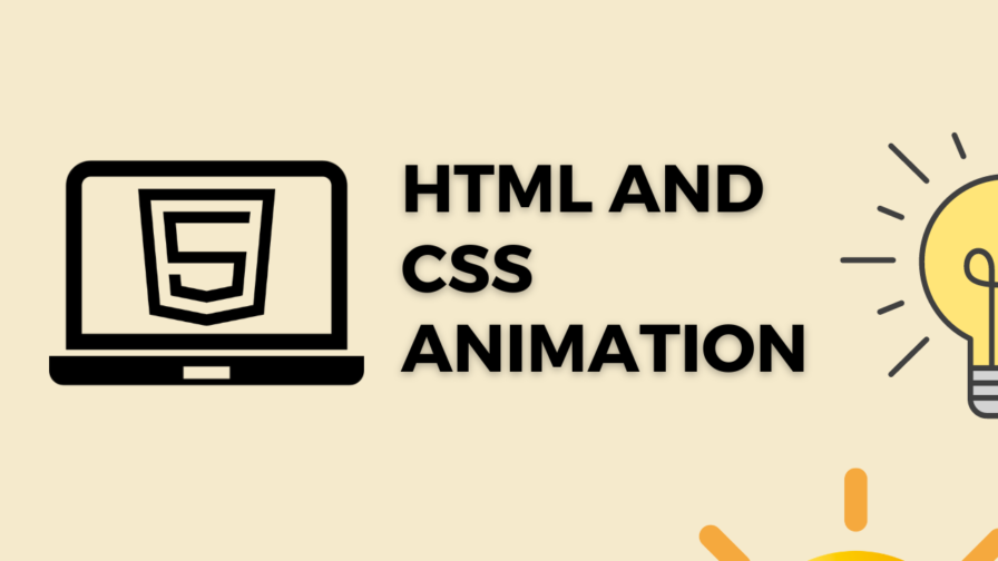
Learn to create Hypnosis spiral Animation using HTML and CSS
In the ever-evolving world of web development, creativity knows no bounds. Every day, developers find innovative ways to captivate their audience, creating immersive and engaging user experiences. One such mesmerizing spectacle is the Hypnosis Spiral Animation, a captivating visual trick that can be achieved using the dynamic duo of HTML and CSS.
You can find how to install and get started with Visual Studio code by checking out my tutorial – Running HTML using Live server in Visual Studio Code Editor – Salow Studios
CSS Properties
Following are the CSS properties used:
Background: The background shorthand CSS property sets all background style properties at once, such as color, image, origin and size, or repeat method. Component properties not set in the background shorthand property value declaration are set to their default values.
Margin-left: The margin-left CSS property sets the margin area on the left side of an element. A positive value places it farther from its neighbors, while a negative value places it closer.
Content: The content CSS property replaces an element with a generated value. Objects inserted using the content property are anonymous replaced elements.
Border-radius: The border-radius CSS property rounds the corners of an element’s outer border edge. You can set a single radius to make circular corners, or two radii to make elliptical corners.
Width: The width CSS property sets an element’s width. By default, it sets the width of the content area, but if box-sizing is set to border-box, it sets the width of the border area.
Inset: The inset CSS property is a shorthand that corresponds to the top, right, bottom, and/or left properties. It has the same multi-value syntax of the margin shorthand.
Height: The height CSS property specifies the height of an element. By default, the property defines the height of the content area. If box-sizing is set to border-box, however, it instead determines the height of the border area.
Position: The position CSS property sets how an element is positioned in a document. The top, right, bottom, and left properties determine the final location of positioned elements.
Code Block for creating Hypnosis spiral
Here is the code for implementing the Hypnosis spiral Animation.
.hypnotic-spiral {
        width: 150px;
        height: 150px;
        margin-left: 120px;
        position: relative;
        border-radius: 50%;
        background: repeating-conic-gradient(
          #0000,
          #ffd60a 1deg 18deg,
          #0000 20deg 36deg
        );

      }
      .hypnotic-spiral::before {
        content: "";
        position: absolute;
        border-radius: 50%;
        inset: 0;
        background: inherit;

      }
Yay! We have created the static Hypnosis spiral Animation.
Here is the output:

Code block for creating Hypnosis spiral CSS Animation
spin animation can be implemented by scaling up and down the shape linearly.
Following are the classes used for animation.
The @keyframes CSS at-rule controls the intermediate steps in a CSS animation sequence by defining styles for keyframes (or waypoints) along the animation sequence. This gives more control over the intermediate steps of the animation sequence than transitions.
The transform CSS property lets you rotate, scale, skew, or translate an element. It modifies the coordinate space of the CSS visual formatting model.
Here is the CSS animation class implementing CSS.
@keyframes  spin {
        100% {
          transform: rotate(0.5turn);
        }
      }
The following way is to declare the CSS Class inside the class block.
 .hypnotic-spiral {
        width: 150px;
        height: 150px;
        margin-left: 120px;
        position: relative;
        border-radius: 50%;
        background: repeating-conic-gradient(
          #0000,
          #ffd60a 1deg 18deg,
          #0000 20deg 36deg
        );
        animation: spin 4s infinite linear;
      }
      .hypnotic-spiral::before {
        content: "";
        position: absolute;
        border-radius: 50%;
        inset: 0;
        background: inherit;
        animation: inherit;
      }
      @keyframes spin {
        100% {
          transform: rotate(0.5turn);
        }
      }
Following is the output for Hypnosis spiral Animation animation.

Video Tutorial for creating Hypnosis spiral
You can find the complete coding tutorial in the following YouTube Short video.
Complete Code using HTML and CSS for creating Hypnosis spiral
Copy and paste the complete code in Visual studio code to view the output.
<!DOCTYPE html>
<html lang="en">
  <head>
    <style>
      .hypnotic-spiral {
        width: 150px;
        height: 150px;
        margin-left: 120px;
        position: relative;
        border-radius: 50%;
        background: repeating-conic-gradient(
          #0000,
          #ffd60a 1deg 18deg,
          #0000 20deg 36deg
        );
        animation: spin 4s infinite linear;
      }
      .hypnotic-spiral::before {
        content: "";
        position: absolute;
        border-radius: 50%;
        inset: 0;
        background: inherit;
        animation: inherit;
      }
      @keyframes spin {
        100% {
          transform: rotate(0.5turn);
        }
      }
    </style>
    <title>Salow Studios</title>
  </head>
  <body>
    <h1>Hypnosis spiral Animation</h1>
    <div class="hypnotic-spiral"></div>
  </body>
</html>
Thank you for reading this article. I hope that it helps you creating your own Hypnosis spiral Animation Animation using CSS and HTML. See you in next tutorial!


