Connect with us!

Satellite spin animation HTML and CSS tutorial for beginners
Satellite rotates around the earth about one of its three axes. Thrusters are used for the maintaining the axis. Have you ever wondered how to create them using CSS and use it in your website? In tis tutorial we will be looking into how to design satellite spin loader animation.
In this article we will see how to create Satellite spin animation using CSS and HTML
The most important properties that we use to create the satellite with spin Animation are:
The transform CSS property lets you rotate, scale, skew, or translate an element. It modifies the coordinate space of the CSS visual formatting model.
The animation shorthand CSS property applies an animation between styles. It is a shorthand for animation-name, animation-duration, animation-timing-function, animation-delay, animation-iteration-count, animation-direction, animation-fill-mode, and animation-play-state.
Table of Contents
Satellite spin Code Block
Here is the code for implementing the satellite.
 .satellite {
        background-color: white;
        height: 50px;
        width: 40px;
        margin: 70px;
        position: relative;
        transform-origin: bottom;
      }
      .satellite::before {
        content: "";
        position: absolute;
        background-color: #ff6d00;
        height: 40px;
        width: 40px;
        border-radius: 50%;
        top: 55px;
      }
      .satellite::after {
        content: "";
        position: absolute;
        background-color: white;
        height: 50px;
        width: 40px;
        top: 100px;
      }
Yay! We have created the static satellite.
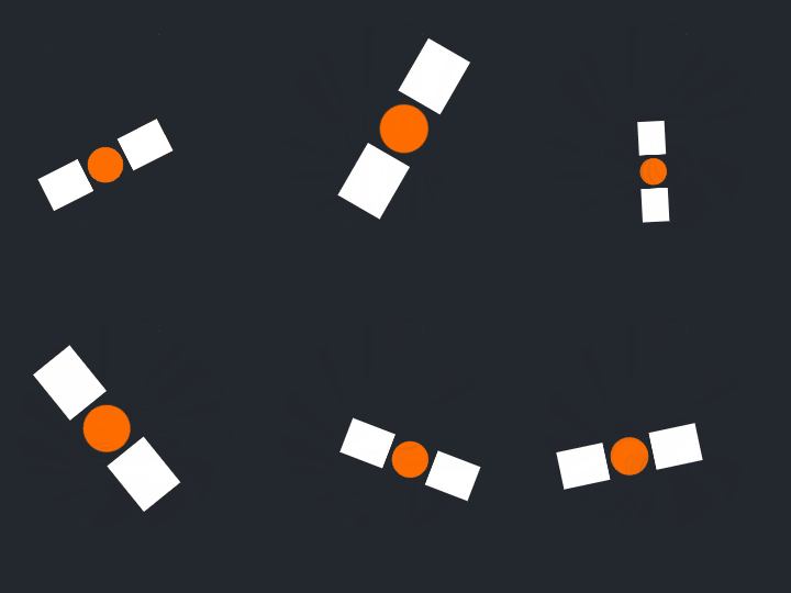
Here is the output:

Satellite spin CSS Animation
Satellite spin is a tricky animation. It is achieved by rotating the object at the bottom of first object.
Following are the classes used for animation.
The @keyframes CSS at-rule controls the intermediate steps in a CSS animation sequence by defining styles for keyframes (or waypoints) along the animation sequence. This gives more control over the intermediate steps of the animation sequence than transitions.
The transform CSS property lets you rotate, scale, skew, or translate an element. It modifies the coordinate space of the CSS visual formatting model.
Here is the CSS animation class implementing CSS.
@keyframes grow {
        100% {
          transform: rotate(360deg) scale(0.5);
        }
        50% {
          transform: rotate(180deg) scale(1);
        }
        0% {
          transform: rotate(0deg) scale(0.5);
        }
      }
The following way is to declare the CSS Class inside the class block.
.satellite {
        background-color: white;
        height: 50px;
        width: 40px;
        margin: 70px;
        position: relative;
        transform-origin: bottom;
        animation: grow 2s linear infinite;
      }
      .satellite::before {
        content: "";
        position: absolute;
        background-color: #ff6d00;
        height: 40px;
        width: 40px;
        border-radius: 50%;
        top: 55px;
      }
      .satellite::after {
        content: "";
        position: absolute;
        background-color: white;
        height: 50px;
        width: 40px;
        top: 100px;
      }
      @keyframes grow {
        100% {
          transform: rotate(360deg) scale(0.5);
        }
        50% {
          transform: rotate(180deg) scale(1);
        }
        0% {
          transform: rotate(0deg) scale(0.5);
        }
      }
Following is the output of satellite spin animation

Satellite spin Video Tutorial
You can find the complete coding tutorial in the following YouTube video.
Complete Code using HTML and CSS
Copy and paste the complete code in Visual studio code to view the output.
<!DOCTYPE html>
<html lang="en">
  <head>
    <style>
      .satellite {
        background-color: white;
        height: 50px;
        width: 40px;
        margin: 70px;
        position: relative;
        transform-origin: bottom;
        animation: grow 2s linear infinite;
      }
      .satellite::before {
        content: "";
        position: absolute;
        background-color: #ff6d00;
        height: 40px;
        width: 40px;
        border-radius: 50%;
        top: 55px;
      }
      .satellite::after {
        content: "";
        position: absolute;
        background-color: white;
        height: 50px;
        width: 40px;
        top: 100px;
      }
      @keyframes grow {
        100% {
          transform: rotate(360deg) scale(0.5);
        }
        50% {
          transform: rotate(180deg) scale(1);
        }
        0% {
          transform: rotate(0deg) scale(0.5);
        }
      }
    </style>
    <title>Salow Studios</title>
  </head>
  <body>
    <h1>Satellite Spin Animation</h1>
    <div class="satellite"></div>
  </body>
</html>
Thank you for reading this article. I hope that it helps you creating your own Satellite Spin Animation using CSS and HTML. Good luck and happy coding !


