Connect with us!

Ceiling Fan Animation HTML and CSS Tutorial For Beginners
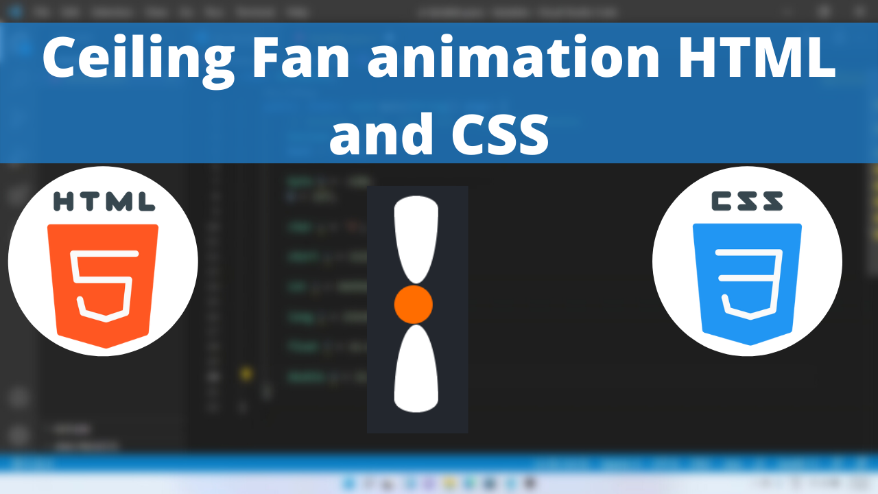
Ceiling fans provide circulating air around the living space in order to keep the area cool. Have you ever wondered how to create them using CSS and use it in your website? In this tutorial we will be looking into ceiling fan with spin animation.
The transform-origin CSS property sets the origin for an element’s transformations.
The box-shadow CSS property adds shadow effects around an element’s frame. You can set multiple effects separated by commas. A box shadow is described by X and Y offsets relative to the element, blur and spread radius, and color.
Table of Contents
Ceiling Fan Animation Code Block
Here is the code for implementing the ceiling fan.
.ceiling-fan {
        background-color: #ff6d00;
        height: 35px;
        width: 35px;
        border-radius: 50%;
        margin: 90px;
        position: relative;
        transform-origin: center;
      }
      .ceiling-fan::before {
        content: "";
        position: absolute;
        background-color: white;
        height: 80px;
        width: 40px;
        border-radius: 50% 50% 50% 50% / 85% 85% 15% 15%;
        top: 36px;
      }
      .ceiling-fan::after {
        content: "";
        position: absolute;
        background-color: white;
        height: 80px;
        width: 40px;
        border-radius: 50% 50% 50% 50% / 15% 15% 85% 85%;
        top: -82px;
      }
Yay! We have created the static ceiling fan.
Here is the output:

CSS Animation
Spin animation is by rotating the object at its center axis.
Following are the classes used for animation.
The @keyframes CSS at-rule controls the intermediate steps in a CSS animation sequence by defining styles for keyframes (or waypoints) along the animation sequence. This gives more control over the intermediate steps of the animation sequence than transitions.
The transform CSS property lets you rotate, scale, skew, or translate an element. It modifies the coordinate space of the CSS visual formatting model.
Here is the CSS animation class implementing CSS.
@keyframes spin {
        100% {
          transform: rotate(360deg);
        }
        50% {
          transform: rotate(180deg);
        }
        0% {
          transform: rotate(0deg);
        }
      }
The following way is to declare the CSS Class inside the class block.
@keyframes spin {
        100% {
          transform: rotate(360deg);
        }
        50% {
          transform: rotate(180deg);
        }
        0% {
          transform: rotate(0deg);
        }
      }
      .ceiling-fan {
        background-color: #ff6d00;
        height: 35px;
        width: 35px;
        border-radius: 50%;
        margin: 90px;
        position: relative;
        transform-origin: center;
        animation: spin 0.5s linear infinite;
      }
      .ceiling-fan::before {
        content: "";
        position: absolute;
        background-color: white;
        height: 80px;
        width: 40px;
        border-radius: 50% 50% 50% 50% / 85% 85% 15% 15%;
        top: 36px;
      }
      .ceiling-fan::after {
        content: "";
        position: absolute;
        background-color: white;
        height: 80px;
        width: 40px;
        border-radius: 50% 50% 50% 50% / 15% 15% 85% 85%;
        top: -82px;
      }
Following is the output of ceiling fan animation

Video Tutorial
You can find the complete coding tutorial in the following YouTube video.
Complete Code using HTML and CSS
Copy and paste the complete code in Visual studio code to view the output.
<!DOCTYPE html>
<html lang="en">
  <head>
    <style>
      @keyframes spin {
        100% {
          transform: rotate(360deg);
        }
        50% {
          transform: rotate(180deg);
        }
        0% {
          transform: rotate(0deg);
        }
      }
      .ceiling-fan {
        background-color: #ff6d00;
        height: 35px;
        width: 35px;
        border-radius: 50%;
        margin: 90px;
        position: relative;
        transform-origin: center;
        animation: spin 0.5s linear infinite;
      }
      .ceiling-fan::before {
        content: "";
        position: absolute;
        background-color: white;
        height: 80px;
        width: 40px;
        border-radius: 50% 50% 50% 50% / 85% 85% 15% 15%;
        top: 36px;
      }
      .ceiling-fan::after {
        content: "";
        position: absolute;
        background-color: white;
        height: 80px;
        width: 40px;
        border-radius: 50% 50% 50% 50% / 15% 15% 85% 85%;
        top: -82px;
      }
    </style>
    <title>Salow Studios</title>
  </head>
  <body>
    <h1>Ceiling Fan Animation</h1>
    <div class="ceiling-fan"></div>
  </body>
</html>
Thank you for reading this article. I hope that it helps you creating your own Ceiling fan Animation using CSS and HTML. Good luck and happy coding !


