Connect with us!
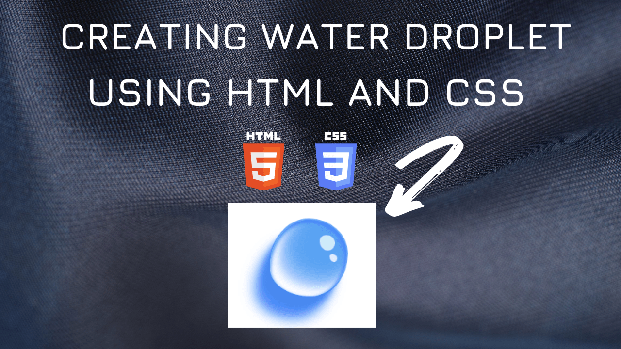
Water Drop Effect using HTML and CSS tutorial for beginners using VS Code Editor
Creating water drop effect using box-shadow property in CSS3.
Water Drop Effect Code Block
Here is the CSS class for implementing.
.droplet {
    position: relative;
    left: 60px;
    background: #54abfb;
    height: 100px;
    width: 100px;
    border-radius: 51% 49% 48% 52% / 62% 44% 56% 38%;
    opacity: 0.8;
    border: 2px solid #3d93ff;
}
    .droplet::before {
    content: "";
    position: absolute;
    background: #318cef;
    height: 100%;
    width: 100%;
    border-radius: 51% 49% 48% 52% / 62% 44% 56% 38%;
    box-shadow: -10px 15px 8px #1b6ceb, -20px 30px 16px #1b6cfb,
      inset -3px 3px 5px #1b6cfb, inset 1px 3px 5px #1a74e5,
      inset 10px -10px 11px white, inset 20px -20px 22px #a8ceff;
}
    .droplet::after {
    content: "";
    position: absolute;
    background: #e6fdfb;
    height: 20px;
    width: 20px;
    border-radius: 44% 56% 46% 54% / 36% 50% 50% 64%;
    left: 65px;
    top: 20px;
    box-shadow: 8px 20px 0 -5px white;
    opacity: 0.8;
}
Here is the output

Water Drop Effect Video Tutorial
You can find the complete coding in the following YouTube Video
Here is the complete HTML and CSS:
<!DOCTYPE html>
<html lang="en">
  <head>
    <style>
      .droplet {
        position: relative;
        left: 60px;
        background: #54abfb;
        height: 100px;
        width: 100px;
        border-radius: 51% 49% 48% 52% / 62% 44% 56% 38%;
        opacity: 0.8;
        border: 2px solid #3d93ff;
      }
      .droplet::before {
        content: "";
        position: absolute;
        background: #318cef;
        height: 100%;
        width: 100%;
        border-radius: 51% 49% 48% 52% / 62% 44% 56% 38%;
        box-shadow: -10px 15px 8px #1b6ceb, -20px 30px 16px #1b6cfb,
          inset -3px 3px 5px #1b6cfb, inset 1px 3px 5px #1a74e5,
          inset 10px -10px 11px white, inset 20px -20px 22px #a8ceff;
      }
      .droplet::after {
        content: "";
        position: absolute;
        background: #e6fdfb;
        height: 20px;
        width: 20px;
        border-radius: 44% 56% 46% 54% / 36% 50% 50% 64%;
        left: 65px;
        top: 20px;
        box-shadow: 8px 20px 0 -5px white;
        opacity: 0.8;
      }
    </style>
    <title>Salow Studios</title>
  </head>
  <body>
    <h1>Water Droplet</h1>
    <div class="droplet"></div>
  </body>
</html>


