Connect with us!
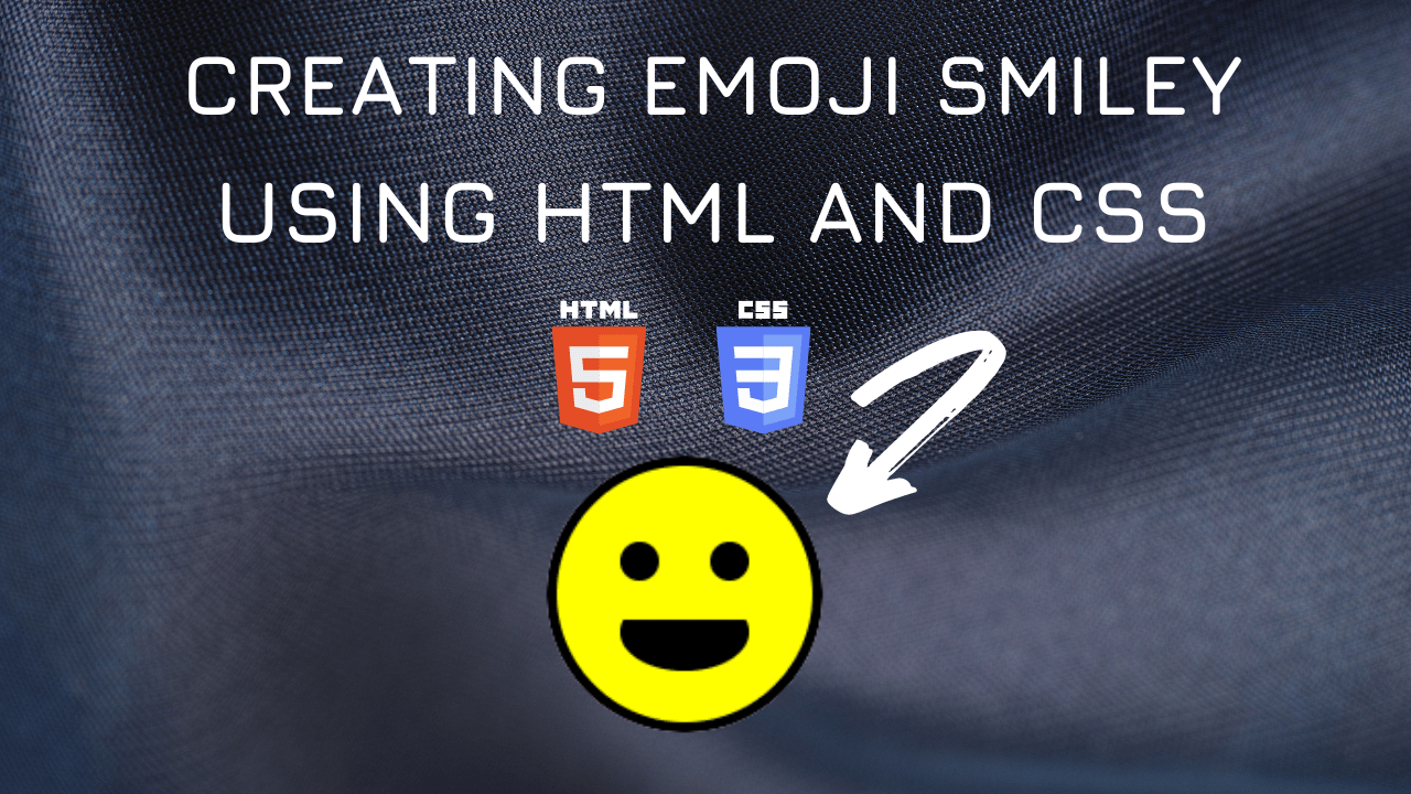
Emoji Smiley Face 🙂😃 using HTML and CSS tutorial for beginners using VS Code Editor
A smiley, alluded to as a smiley face, is an essential ideogram that addresses a grinning face. Since the 1950s it has become part of mainstream society around the world, utilized either as an independent ideogram, or as a type of correspondence, like emojis. The smiley started as two spots and a line to address eyes and a mouth. More intricate plans during the 1950s arose, with noses, eyebrows, and frameworks. A yellow and dark plan was utilized by the New York based radio broadcast WMCA for its “Heroes” crusade in the mid 1960s. More yellow and dark plans showed up during the 1960s and 70s including works by Franklin Loufrani and Harvey Ross Ball. Today, The Smiley Company holds many privileges to the smiley ideogram and has become one of the greatest permitting organizations universally.
Table of Contents
Emoji Smiley Face Code Block
Here is the CSS class for implementing
.emoji {
  position: relative;
  width: 100px;
  height: 100px;
  background-color: yellow;
  border-radius: 50%;
  border: 4px solid black;
}
.emoji::before,
.emoji::after {
  content: "";
  position: absolute;
  top: 30%;
  width: 15px;
  height: 15px;
  background: black;
  border-radius: 50%;
}
.emoji::before {
  left: 25%;
}
.emoji::after {
  right: 25%;
}
.mouth {
  position: relative;
  width: 50px;
  height: 10px;
  border-radius: 50%;
  border-bottom: 20px solid black;
  top: 50%;
  left: 25%;
}
Here is the output

Video Tutorial for Emoji Smiley Face using CSS
You can find the complete coding in the following YouTube Video
Here is the complete HTML and CSS:
<!DOCTYPE html>
<html lang="en">
  <head>
    <style>
      .emoji {
        position: relative;
        width: 100px;
        height: 100px;
        background-color: yellow;
        border-radius: 50%;
        border: 4px solid black;
      }
      .emoji::before,
      .emoji::after {
        content: "";
        position: absolute;
        top: 30%;
        width: 15px;
        height: 15px;
        background: black;
        border-radius: 50%;
      }
      .emoji::before {
        left: 25%;
      }
      .emoji::after {
        right: 25%;
      }
      .mouth {
        position: relative;
        width: 50px;
        height: 10px;
        border-radius: 50%;
        border-bottom: 20px solid black;
        top: 50%;
        left: 25%;
      }
    </style>
    <title>Salow Studios</title>
  </head>
  <body>
    <h1>Icon Design</h1>
    <div class="emoji">
      <div class="mouth"></div>
    </div>
  </body>
</html>