Connect with us!
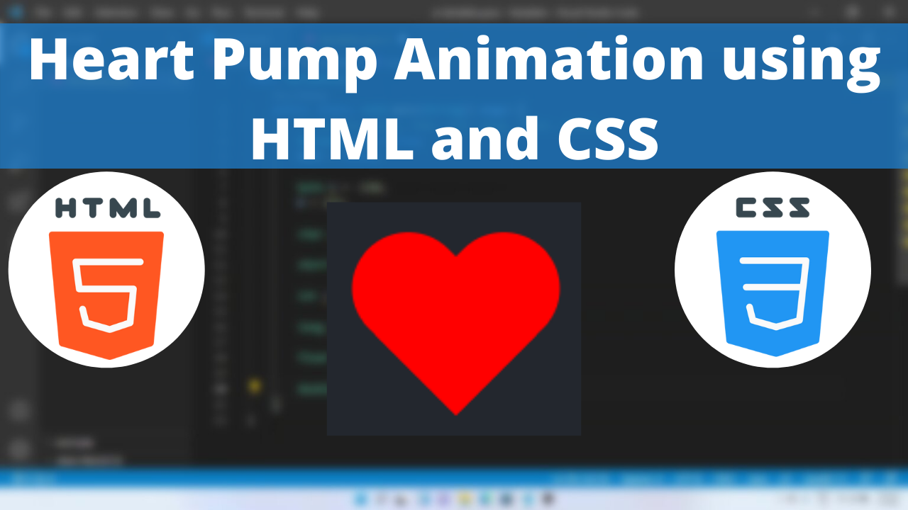
Heart Pump Animation using HTML and CSS tutorial for beginners
Heart is an ideograph used to express the idea of “heart” in symbolic sense to express love. We are all familiar with the various social media platforms like Instagram and TikTok. Heart shape implements the love for a content.
In this article we will see how to program in CSS to create a heart pump animation.
The transform CSS property lets you rotate, scale, skew, or translate an element. It modifies the coordinate space of the CSS visual formatting model.
The animation shorthand CSS property applies an animation between styles. It is a shorthand for animation-name, animation-duration, animation-timing-function, animation-delay, animation-iteration-count, animation-direction, animation-fill-mode, and animation-play-state.
Heart Pump Animation Code Block
Here is the code for implementing the heart symbol.
.heart {
        position: relative;
        width: 100px;
        height: 90px;
      }
      .heart:before,
      .heart:after {
        position: absolute;
        content: "";
        left: 50px;
        top: 0;
        width: 50px;
        height: 80px;
        background: red;
        border-radius: 50px 50px 0 0;
        transform: rotate(-45deg);
        transform-origin: 0 100%;
      }
      .heart:after {
        left: 0;
        transform: rotate(45deg);
        transform-origin: 100% 100%;
      }
Yay! We have created the static heart symbol.
Here is the output:

Heart Pump Animation CSS Animation
Pumping animation can be implemented by scaling up and down the shape linearly.
Following are the classes used for animation.
The @keyframes CSS at-rule controls the intermediate steps in a CSS animation sequence by defining styles for keyframes (or waypoints) along the animation sequence. This gives more control over the intermediate steps of the animation sequence than transitions.
The transform CSS property lets you rotate, scale, skew, or translate an element. It modifies the coordinate space of the CSS visual formatting model.
Here is the CSS animation class implementing CSS.
 @keyframes pump {
        0% {
          transform: scale(0.95);
        }
        5% {
          transform: scale(1.1);
        }
        39% {
          transform: scale(0.85);
        }
        45% {
          transform: scale(1);
        }
        60% {
          transform: scale(0.95);
        }
        100% {
          transform: scale(0.9);
        }
      }
The following way is to declare the CSS Class inside the class block.
 @keyframes pump {
        0% {
          transform: scale(0.95);
        }
        5% {
          transform: scale(1.1);
        }
        39% {
          transform: scale(0.85);
        }
        45% {
          transform: scale(1);
        }
        60% {
          transform: scale(0.95);
        }
        100% {
          transform: scale(0.9);
        }
      }
      .heart {
        position: relative;
        width: 100px;
        height: 90px;
        animation: pump 1s linear infinite;
      }
      .heart:before,
      .heart:after {
        position: absolute;
        content: "";
        left: 50px;
        top: 0;
        width: 50px;
        height: 80px;
        background: red;
        border-radius: 50px 50px 0 0;
        transform: rotate(-45deg);
        transform-origin: 0 100%;
      }
      .heart:after {
        left: 0;
        transform: rotate(45deg);
        transform-origin: 100% 100%;
      }
Following is the output of heart pump animation

Heart Pump Animation Video Tutorial
You can find the complete coding tutorial in the following YouTube video.
Complete Code using HTML and CSS
Copy and paste the complete code in Visual studio code to view the output.
<!DOCTYPE html>
<html lang="en">
  <head>
    <style>
      @keyframes pump {
        0% {
          transform: scale(0.95);
        }
        5% {
          transform: scale(1.1);
        }
        39% {
          transform: scale(0.85);
        }
        45% {
          transform: scale(1);
        }
        60% {
          transform: scale(0.95);
        }
        100% {
          transform: scale(0.9);
        }
      }
      .heart {
        position: relative;
        width: 100px;
        height: 90px;
        animation: pump 1s linear infinite;
      }
      .heart:before,
      .heart:after {
        position: absolute;
        content: "";
        left: 50px;
        top: 0;
        width: 50px;
        height: 80px;
        background: red;
        border-radius: 50px 50px 0 0;
        transform: rotate(-45deg);
        transform-origin: 0 100%;
      }
      .heart:after {
        left: 0;
        transform: rotate(45deg);
        transform-origin: 100% 100%;
      }
    </style>
    <title>Salow Studios</title>
  </head>
  <body>
    <h1>Heart pump Animation</h1>
    <div class="heart"></div>
  </body>
</html>
Thank you for reading this article. I hope that it helps you creating your own Heart pump Animation using CSS and HTML. Good luck and happy coding !


