Connect with us!
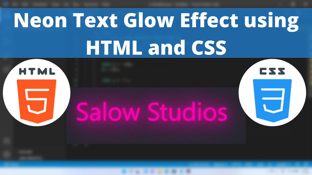
Neon Text Glow Effect using HTML and CSS tutorial for beginners using VSCode Editor
CSS is a style sheet language which can help you to style your own webpage. We all want our page to be more aesthetic and more artistic, Neon Text is one of the method to achieve it.
In this article we will see how to program in css to create Neon Text.
The most important properties that we use to create the heart element are:
The position is a common property which helps us to specify the type of positioning method used for an element.
The left CSS property participates in specifying the horizontal position of a positioned element. It has no effect on non-positioned elements.
The text-shadow CSS property adds shadows to text. It accepts a comma-separated list of shadows to be applied to the text and any of its decorations. Each shadow is described by some combination of X and Y offsets from the element, blur radius, and color.
Here is the CSS class for implementing it.
Neon Text Glow Code Block
.neon-text {
        color: #fe01b1;
        left: 50pt;
        position: absolute;
        font-size: 40pt;
        text-shadow: 0 0 5px #fe01b1, 0 0 25px #fe01b1, 0 0 50px #fe01b1,
          0 0 75px #fe01b1, 0 0 100px #fe01b1;
      }
Yay! We have created the initial text.
Here is the output:

Neon Text Glow CSS Animation
Wobble is creating a pattern to move an object from side to side.
Following are the classes used for animation.
The @keyframes CSS at-rule controls the intermediate steps in a CSS animation sequence by defining styles for keyframes (or waypoints) along the animation sequence. This gives more control over the intermediate steps of the animation sequence than transitions.
The transform CSS property lets you rotate, scale, skew, or translate an element. It modifies the coordinate space of the CSS visual formatting model.
Here is the CSS animation class implementing CSS.
@keyframes wobble {
        0% {
          transform: translateX(0%);
        }
        15% {
          transform: translateX(-25%) rotate(-5deg);
        }
        30% {
          transform: translateX(20%) rotate(3deg);
        }
        45% {
          transform: translateX(-15%) rotate(-3deg);
        }
        60% {
          transform: translateX(10%) rotate(2deg);
        }
        75% {
          transform: translateX(-5%) rotate(-1deg);
        }
        100% {
          transform: translateX(0%);
        }
      }
The above declared animation is called inside the CSS Class.
.neon-text {
        color: #fe01b1;
        left: 50pt;
        position: absolute;
        font-size: 40pt;
        text-shadow: 0 0 5px #fe01b1, 0 0 25px #fe01b1, 0 0 50px #fe01b1,
          0 0 75px #fe01b1, 0 0 100px #fe01b1;
        animation: wobble 2s linear infinite;
      }
Below is the output of the glow text wobble animation successfully created!
Here is the output:

You can find the complete coding tutorial in the following Youtube video.
Video Tutorial for Neon Text Glow Effect using HTML and CSS tutorial
Here is the complete code of HTML and CSS for creating Glow Neon Text
<!DOCTYPE html>
<html lang="en">
  <head>
    <style>
      .neon-text {
        color: #fe01b1;
        left: 50pt;
        position: absolute;
        font-size: 40pt;
        text-shadow: 0 0 5px #fe01b1, 0 0 25px #fe01b1, 0 0 50px #fe01b1,
          0 0 75px #fe01b1, 0 0 100px #fe01b1;
        animation: wobble 2s linear infinite;
      }
      @keyframes wobble {
        0% {
          transform: translateX(0%);
        }
        15% {
          transform: translateX(-25%) rotate(-5deg);
        }
        30% {
          transform: translateX(20%) rotate(3deg);
        }
        45% {
          transform: translateX(-15%) rotate(-3deg);
        }
        60% {
          transform: translateX(10%) rotate(2deg);
        }
        75% {
          transform: translateX(-5%) rotate(-1deg);
        }
        100% {
          transform: translateX(0%);
        }
      }
    </style>
    <title>Salow Studios</title>
  </head>
  <body>
    <h1>Glow Neon text animation</h1>
    <div class="neon-text">Salow Studios</div>
  </body>
</html>
Thank you for reading this article. I hope that it helps you creating your own glow neon text animation using CSS and HTML. Good luck and happy coding !


