Connect with us!
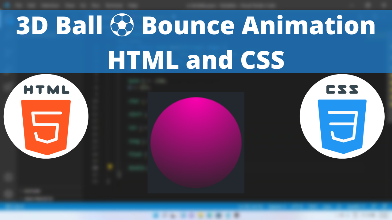
3D Ball ⚽ Bounce Animation HTML and CSS tutorial for beginners VSCode Editor
Creating cool animation for our website is become more easier by the new CSS3. In this tutorial we will be looking into how to create a 3D bouncing ball animation.
In this article we will see how to program 3D Ball bouncing animation using CSS.
The most important properties that we use to create the 3D ball animations are:
The position is a common property which helps us to specify the type of positioning method used for an element.
The background-image CSS property sets one or more background images on an element.
The radial-gradient() CSS function creates an image consisting of a progressive transition between two or more colors that radiate from an origin. Its shape may be a circle or an ellipse.
Here is the CSS class for implementing it.
Table of Contents
3D Ball Code Block
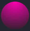
.circle-3d {
        width: 100px;
        height: 100px;
        border-radius: 50%;
        position: relative;
        background-image: radial-gradient(circle at top, #fe01b1, #222);
      }
Yay! We have created the initial 3D looking ball.
Here is the output:
3D Ball CSS Animation
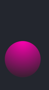
Bouncing animation is by moving the ball from up to down.
Following are the classes used for animation.
The @keyframes CSS at-rule controls the intermediate steps in a CSS animation sequence by defining styles for keyframes (or waypoints) along the animation sequence. This gives more control over the intermediate steps of the animation sequence than transitions.
The animation-timing-function CSS property sets how an animation progresses through the duration of each cycle.
Here is the CSS animation class implementing CSS.
@keyframes ballbounce {
        0%,
        100% {
          bottom: -9em;
        }
        50% {
          bottom: 1em;
          animation-timing-function: ease-out;
        }
      }
The following way is to declare the CSS Class inside the class block.
.circle-3d {
        width: 100px;
        height: 100px;
        border-radius: 50%;
        animation: ballbounce 2s linear infinite;
        position: relative;
        background-image: radial-gradient(circle at top, #fe01b1, #222);
      }
Following is the output bouncing animation!
Here is the output:
You can find the complete coding tutorial in the following YouTube video.
3D Ball ⚽ Bounce Animation HTML and CSS tutorial for beginners VSCode Editor
Here is the complete code of HTML and CSS for creating 3D Ball ⚽ Bounce Animation
<!DOCTYPE html>
<html lang="en">
  <head>
    <style>
      .circle-3d {
        width: 100px;
        height: 100px;
        border-radius: 50%;
        animation: ballbounce 2s linear infinite;
        position: relative;
        background-image: radial-gradient(circle at top, #fe01b1, #222);
      }
      @keyframes ballbounce {
        0%,
        100% {
          bottom: -9em;
        }
        50% {
          bottom: 1em;
          animation-timing-function: ease-out;
        }
      }
    </style>
    <title>Salow Studios</title>
  </head>
  <body>
    <h1>3D Ball Bounce animation</h1>
    <div class="circle-3d"></div>
  </body>
</html>
Thank you for reading this article. I hope that it helps you creating your own 3D Ball ⚽ Bounce Animation using CSS and HTML. Good luck and happy coding !